This is a really badass design! I love the cyborg monster idea you have going here, and I think I know what's really hurting the 3-dimensionality of the piece, and it's NOT a lack of color and shading.
All of my teachers say, "If a drawing isnt solid to start with, no amount of rendering will save it." So throwing color and rendering on top wont fix your problems!
I think the need to draw through and around is your biggest problem in terms of dimensionality.

If I recall, you tend to draw just contours, right? You dont really use any under-structure? There is a lot of value to drawing an under-structure. If you draw solid shapes first then your line work can wrap around those solid volumes. That's what's missing from your piece and what is flattening it out. Lines are just lines; they don't define volumes.
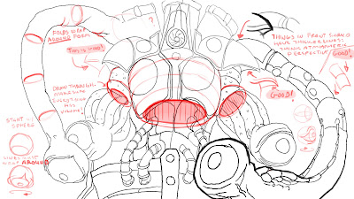
Let's look at the eyeballs. Right now, you just have lines. I can tell what you're going for, but the lines dont actually describe the volume of the eye because they are not wrapping around a volume. I drew some eyeballs next to your to show what I mean, and to show how drawing around a volume can make them really solid.
Now let's look at the point where the arms connect to the eye tentacles. What you've drawn does not describe anything with volume because we dont see the arm wrapping around and behind the tentacles; the arms is on the same plane as the tentacles and it's certainly never behind it.
I've drawing some ellipses with a lip, defining the arm hole that those tentacles are sliding into. That lip indicates to the viewer "this arm is both in front and behind the tentacles, because they are sliding INTO it."
Same thing with the connection point between the chest armor and the midsection. The armor is on top of the mid section, but it certainly does not wrap around it. Maybe it's not supposed to, but the drawing would be a lot more solid and it would have a lot more depth and dimension if it did.
Again, I drew an ellipse with a lip to define the hole that the midsection fits into.
There are a few areas where you did a great job using overlaps to show exactly that. The shoulder armor definitely feels like it rests on top of the arms. That's because we see the lines wrapping around the arm; the lines are both in front and move behind it. The tentacle segments on the right side of the drawing have good, descriptive overlap.
To top it off, a nice fine detail that will push your perspective is the use of line weight. You have an eye-tentacle coming toward camera, so I thickened up the lines on it. See how it pops a little more? This is kind of like atmospheric perspective, but for lines. The closer the object, the thicker the line should be (relative to the lines behind it). Do this throughout the drawing and it will look really badass.
I hope this makes sense and is helpful. These are all ideas that I never heard at LMU. I personally struggle with these ideas now, and I'm CONSTANTLY called out at CDA when my work lacks them.
What do you think guys? Anybody disagree or have anything to add?
-JJ


