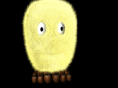
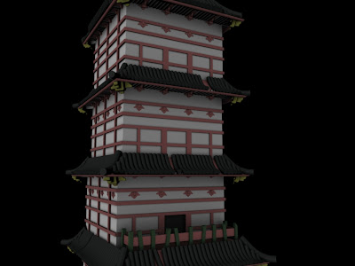
My thesis is an alternately Japanese and Salvador Dali inspired short, so my characters and assets are a bit strange to say the least. But they are all modeled and colored at this point, and now its time to build and light my sets. Also rigging... but I try not to think about that. Here are a few random screen shots. Enjoy!
Billium: one of of multiple fur-ball aliens
Charlie: my main character, a large monster lost in a strange world
A flower on the alien planet (where the fur-balls live)
A large tree on the alien planet
A five story pagoda building from the alien planet
Comments are greatly appreciated!
~Sam


This comment has been removed by the author.
ReplyDeleteThis comment has been removed by the author.
ReplyDeleteLooking good, but there are a few suggestions. The main, overarching note is about your texturing. I think, in general, it needs more gradient, more patterning, and it needs to be more specific.
ReplyDeleteI really like the design on the flower, but if you're trying to push it into realistic territory I think there's a few things to consider.
http://images.mooseyscountrygarden.com/garden-plants/flower-picture-gallery/daylily-orange-flower.jpg
First, look at how the edges of the peddles on that flower are uneven. You'll rarely find something that looks as machine cut as your flower's peddles. I also think it needs a little more thickness. Not much! Just a little.
Second, check out the coloring on the peddles in the picture. The peddles have some patterning going on, and they introduce other colors.
http://ob-noxious.org/wp-content/uploads/2010/06/Flower.jpg
http://www.cssnz.org/reverselandingpad.jpg
Even in these, which appear to be closer to one color, have subtle shifts in color and patterning.
Similar notes on the Mushroom. Basically, I think you just need to integrate a little more color and pattern.
ReplyDeletehttp://faculty.ksu.edu.sa/73619/Pictures%20Library/mushroom.jpg
http://magic-mushroom.com/wp-content/uploads/2008/04/wild-magic-mushrooms.jpg
http://www.treehugger.com/mushroom.jpg
I like the purple/black texture you've got going. That's really cool, but it's too uniform. Check out those images above and note how there's a subtle gradient from the top of the mushroom's "hat" to the bottom rim.
In some cases it gradients from red to yellow. In others in gradients from dark to light. In some it's a very subtle gradient from red to red-orange, but in that case the red color starkly contrasts it's white stock.
So I'd suggest integrating some of that into the texture. For example, imagine if that slime was more bright and alive on top of the "hat" but once it drips over the side it starts to darken. Kinda like lava...
http://davidavery.files.wordpress.com/2008/04/1-lava-flow.jpg
...only more subtle.
Same gradient note applies to the stem of the mushroom. The color is too uniform and needs a bit of gradient.
A lot of the same notes apply for Charlie. Check out these Rhinos:
ReplyDeletehttp://upload.wikimedia.org/wikipedia/commons/thumb/1/12/Rhinoceros_unicornis_-Buffalo_Zoo-8.jpg/800px-Rhinoceros_unicornis_-Buffalo_Zoo-8.jpg
http://www.animalpictures1.com/data/media/108/Rhinoceros-6.jpg
http://upload.wikimedia.org/wikipedia/commons/1/14/RHINOCEROS_0366.JPG
http://theora.com/images/rhinoceros.jpg
Even in the rhinos with the most solid color, there is a subtle color change around the folds, under the belly, and on the feet. But in extremes, there's an array of browns, grays, and charcoals that play up different features.
Take really close note a how the color change is not arbitrary. It's like a pair of well worn jeans. On raised areas the color is more faded, but the color is deeper and darker in the cracks and crevices
And a note on the texture you DO have on Charlie, all those creases and cracks. I love them! However, try to be more specific with them. Again, check out the Rhinos.
ReplyDeleteLook at how they have areas like the feet, where the texture is very small and fine. Now look at the thigh, shoulder, and ass, and note how the texture is just bigger, not as fine. And since I'm getting nitpicky, consider the direction of the cracks.
http://us.123rf.com/400wm/400/400/saltov/saltov0802/saltov080200046/2592307.jpg
Look at the creases and wrinkles on your body. First note how they are mostly at joints or where muscle causes skin to fold (ie the face). Now notice how the wrinkle goes perpendicular to the "axis" of the joint or fold. Check out the inside of the elbow, the knuckles joints on the fingers. Wrinkles and folds are caused by the constant folding of skin, so when you place Charlie's wrinkles and folds, put them in places where the skin would fold, and make sure it's in the right direction.
So, Charlie probably would not have vertical running wrinkles on his eyelid, rather they would be horizontal (if he had any at all) since the eyelid opens up and down. Similarly, he would probably have more creases at the tear duct area than he would at the top of the eye. Same consideration with the legs. He'd have more skin creasing at the knees that he would on the thighs.
On top of all that, you can use detail and texture to help guide the eye. If you use more detail on areas of focus, the viewer will more quickly look at that area. If you have an even coating of detail, nothing stands out.
Really, all of my notes are nit-picks because you already have really solid work. These are just ideas that I think can push your work even farther.
To be dead honest, it's likely that the ideas I suggested would go unnoticed by the viewer, but they would all help sell the realism of the illusion you're creating. The more perfect you are, the less people will notice it. But that's kind of the point. If something reads as real people just kind of accept it, right? It all about helping the viewer suspend their disbelief.
Anyway, I hope that mini-novel helps!
-JJ
This comment has been removed by the author.
ReplyDeleteThis comment has been removed by the author.
ReplyDeletePS: Sorry for breaking up the posts. Blogger made me do it!
ReplyDeleteCan we see a screen shot soon?
ReplyDelete